iPhone Size
iPhone Size templates optimize your e-commerce visuals for perfect display on iPhones. Customize effortlessly to boost engagement and sales with mobile-friendly content creation.

80 results found for "iPhone Size"
Videos
Images

All the Smart Tools You Need to Streamline Your Content Creation

Video Editor
A powerful all-in-one video editing tool packed with features.

Sales Poster
Effortlessly create AI-powered promotional posters for your products.

Smart Crop
Crop videos to perfectly fit any platform's aspect ratio.
Custom Avatar
Create your own unique digital avatar for a personalized touch.

Image Editor
Your go-to tool for creating and editing images with ease.
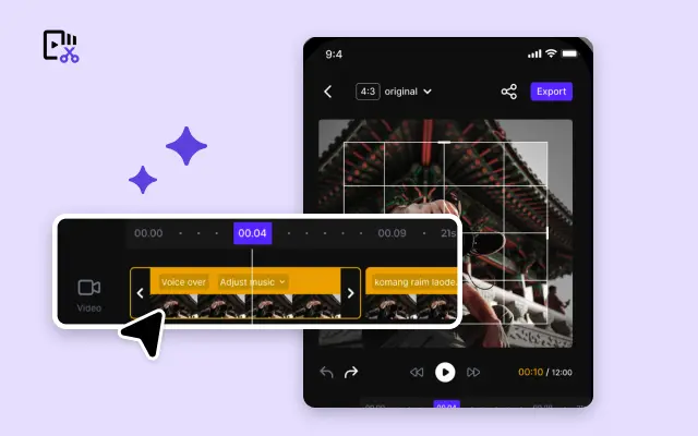
Quick Cut
Speed up video editing by transcribing and editing directly from text.

Remove Background
Instantly remove backgrounds from images with one click.
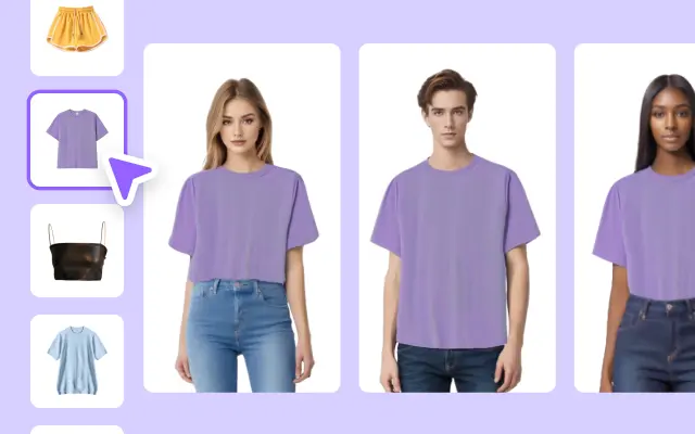
AI Model
Showcase your clothing on AI models for an immersive try-on experience.
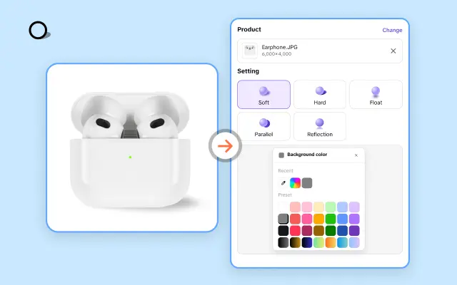
AI Shadows
Add lifelike shadows and lighting to products for enhanced realism.
About iPhone Size
In today's fast-paced digital marketplace, optimizing content for mobile devices is no longer optional—it’s essential. With millions of users accessing e-commerce platforms via iPhones, creating engaging video and graphic content that perfectly fits iPhone screen sizes is crucial for business success.
Many businesses face challenges when their multimedia content displays incorrectly on iPhones, such as cropping, distortion, or slow loading times—problems that can lead to lost customers. Pippit addresses this by offering a comprehensive library of iPhone size templates professionally designed to optimize e-commerce video and image layouts. These templates ensure your content looks crisp and perfectly scaled across all iPhone models, enhancing user experience and engagement.
Pippit's platform also features an intuitive drag-and-drop editor that requires no advanced design skills, enabling you to tailor templates with ease. Whether you need to create promotional videos or product showcases, our iPhone size templates streamline the editing process, saving you time and reducing costs associated with multiple revisions or technical adjustments.
Elevate your mobile content strategy with Pippit's iPhone size templates and ensure your e-commerce visuals captivate your audience every time. Visit Pippit today to explore customizable templates that fit flawlessly on iPhones and start delivering a seamless shopping experience. Take advantage of our tools now and transform how your brand connects with mobile customers.
